Archives: Inspiration

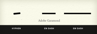
Mind Your En And Em Dashes: Typographic Etiquette

Mind Your En And Em Dashes: Typographic Etiquette

An understanding of typographic etiquette separates the master designers from the novices. A well-trained designer can tell within moments of viewing a design whether its creator knows how to work with typography. Typographic details aren’t just inside jokes among designers. They have been built up from thousands of years of written language, and applying them holds in place long-established principles that enable typography to communicate with efficiency and beauty.  

Handling these typographic details on the Web brings new challenges and restrictions that need to be considered. Below are a few rules of thumb that will have you using typography more lucidly than ever before. Read the whole article on Smashing Magazine.

A Quick & Comprehensive Type Guide [Infographic]

We have an obsession with originality. Whether through our work or through the way we present ourselves on a daily basis. The funny thing is there are no original ideas left. Only re-purposed and re-assembled ideas. When we come to grips with this fact we open ourselves up to do amazing things.

Don’t try to be original, just try to be good. I found this info graphic that does two things really nicely. It show’s the ABC’s of Typography & drives home the idea that we need to be the best at the basics before we are good at something. What do you think? Do you agree or disagree?

A Quick and Comprehensive Type Guide

A quick & comprehensive typeguide - By Noodlor

Awesome Video about Executing …

This video is FANTASTIC. Great talk by the author of The Medici Effect at the 99 Percent conference. Two awesome ideas from it:

1. Your idea is likely wrong, but you won’t know until you try it – thus get out and do it so you can find out what works and what doesn’t.

2. Do the smallest executable step possible so you don’t put all of your resources into attacking one idea. That will give you resources to change directions as you learn what is working and what isn’t.

Great Video, Check it out:


Erik Spiekermann – Putting Back the Face into Typeface

Design is the art of communicating visually. In order to communicate you need to have people to communicate with. Eric Spiekermann first off is a genius and I’m sure he knows it [rightly so]. In an interview with gestalten.tv he shares ideas on new visual languages, design processes, the analogies of music and typography, and why we need better client culture. I think my favorite quote from the entire interview is:

You can’t become a good designer by staying at home and looking at one book. You’ve got be out and talk to other people. Travel, because there is nothing better than realizing that 200km from you door things are different. Whether you live in Berlin, New York or in the middle of no-where things are different when you move out. When you’re twenty one and realize; oh my god! It doesn’t have to be blue. It doesn’t have to be square. It can be different. Read as much as you can. Travel as much as you can. Listen to as many people as you can. Meet as many people as you can. Just gather all this shit for years and years and when your head feels like it’s full then you start over because your head is empty. My head is empty even through it feels full at times. — Erik Spiekermann

Typographer, graphic designer and businessman Erik Spiekermann has created timeless, influential and, yes, Meta-physical work over the past three decades. Next to founding MetaDesign and FontShop, the latter being the first ever digital distributor of fonts, and designing more instant classic typefaces than any other, he has been recognized as an outstanding expert internationally as a lecturer and professor.

via Erik Spiekermann – Putting Back the Face into Typeface on Vimeo.